Scatter Charts / Maps without extensions 

Few days ago I had to implement a distribution graph showing sales per customer on a GoogleMaps.
ScatterChart

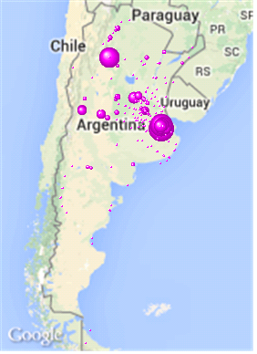
The small bubbles aren’t show

While there are some extensions able to do this no one (at least among free) implements a drag-zoom so that when you zoom in a map area it affect the current selections. On the other hand most of the extensions require at least some changes in its javascript to represent amounts with sizes (grater sales = larger bubble).
Mainly for these two reasons I decided to use a scatter chart to display this information.
Anyone who has used one of these chart previously known that the bubble size often becomes a real problem and the Presentation tab gives few parameters to display the information in a way that meets all the requirements:
1- Larger bubbles should not hide the map nor the smaller adjacent bubbles. This means that increasing the «Symbol Size» it is rarely the right answer.
2- All bubbles must appear, even if in relative percentage of the greatest of all is negligible (eg: some bubbles representing $ 100 million and other $ 1000).
3- The values ​​represent the graph must be real ($ 100 million and $ 1000). Can not display text value other than what is actually sold.
It is understandable that a user wants to see ALL customers on the map and not that being tiny percentages do not appear or are almost invisible. Searching, I found someone asking about the key problem here: how could set the «minimum bubble size» ? Unfortunately the question was not answered, but reviewing the very Qlikvie’s examples I discovered the solution:
To represent a map three expressions are used: the first corresponds to the longitude, the second to the latitude and the third one is the volume or size of the bubble. To set a minimum size while displaying the correct values (as a pop-up) ​​should be used only a «dual» function in this last expression, eg:

dual(‘Sales: ‘ & SUM(SALES),

if(  SUM(SALES) < 0.05 * max(total aggr(sum(SALES),CUSTNMID)) ,

0.05 *  max(total aggr(sum(SALES),CUSTNMID)) ,

SUM(SALES)  )

QlikView will use the text component (first part of the dual) to display when the user hovers the cursor over the bubble, but if sales are less than 5% (0.05) of the sales of the largest customer («max (total aggr (sum (SALES), CUSTNMID)) «) then it defines the size of the bubble as 5% of the size of the largest bubble, thus achieving a» minimum bubble size. «
Aditionally: If you want the bubbles to even distinguish if overlie assigning them a spherical shape and an accent color (eg: rgb (255,0,255)) by putting it in the first expression (longitude).

Gráficos de distribución / Google Maps (sin extensiones)

Hace algunos días tuve que implementar un gráfico de distribución mostrando las ventas por cliente sobre un mapa de GoogleMaps.

mapa

Las burbujas mas pequeñas no se muestran

Si bien existen algunas extensiones capaces de realizar esto ninguna (al menos entre las gratuitas) implementa un drag-zoom tal que al hacer zoom sobre un área del mapa se termina afectando las selecciones actuales, en mi caso los clientes. Por otro lado la mayoría de las extensiones requieren al menos algunas modificaciones en su javascript para representar importes con tamaños (mayores ventas mayor tamaño de la burbuja).

Principalmente por estos dos motivos decidí emplear un gráfico de distribución (scatter chart) para mostrar la información.

Cualquiera que haya usado uno de estos gráficos anteriormente sabe que el tamaño de las burbujas suele transformarse en un verdadero problema y la solapa de «Presentation» da pocos parámetros para poder mostrar la información de un modo que satisfaga todos los requerimientos:

1- Las burbujas más grandes no deben ocultar el mapa y en lo posible la menor cantidad de burbujas adyacentes menores. Es decir que aumentar el “Symbol Size” casi nunca es la repuesta adecuada.

2- Todas las burbujas deben aparecer, aún si en porcentaje relativo de la mayor de todas es insignificante (p.ej: las ventas a un Hipermercado son de 100 millones, y a un comercio minorista en otro punto del país se le vende solo $10.000 – el 0.01% respecto del hipermercado -).

3- Los valores que represente el gráfico deben ser los reales ($100 millones y $10.000 respectivamente). No se puede mostrar en texto otro valor mas que lo que realmente se vendió.

Es entendible que un usuario quiera ver TODOS sus clientes en el mapa y no que, por ser porcentualmente pequeños, algunos no aparezcan o sean casi invisibles. Buscando encontré alguien que da con el concepto clave preguntando como se puede establecer el «tamaño mínimo de la burbuja». Lamentablemente la pregunta no había sido respondida, hasta que revisando el mismísimo código de ejemplos que provee QlikView descubrí la solución:

Para representar un mapa se usan 3 expresiones: la primera corresponde a la longitud, la segunda a la latitud y la tercera es el volumen o tamaño de la burbuja. Para fijar un tamaño mínimo y al mismo tiempo mostrar los valores correctos solo se debe emplear la función dual en esta expresión, p.ej:

dual(‘Sales: ‘ & SUM(SALES),

if(  SUM(SALES) < 0.05 * max(total aggr(sum(SALES),CUSTNMID)) ,

0.05 *  max(total aggr(sum(SALES),CUSTNMID)) ,

SUM(SALES)  )

Qlikview va a usar el componente de texto (primera parte de la dual) para mostrar cuando el usuario pase el cursor sobre la burbuja, pero si las ventas son menores que el  5% de las ventas del mayor cliente ( «max(total aggr(sum(SALES),CUSTNMID))» ) entonces definimos que el tamaño de la burbuja será el 5% del tamaño de la mayor burbuja, logrando de este modo un «tamaño mínimo de burbuja».

Para terminar: Si se quiere que las burbujas se distingan aún si quedan superpuestas sugiero definirles un estilo de forma esférica y asignarles un color destacado (p.ej: rgb(255,0,255)) poniéndolo en la primera expresión, es decir la que define la longitud.